Immigration in the United Kingdom had dropped slightly in the 2016 to 273,000. This still means more children have to learn a second language (English) whist their at school.
These statistic show even though there is a decline in migrant there are still a vast majorities of people who may not speak any English at all when they migrate to the United Kingdom. This strongly suggest there is a market gap for my proposed idea.
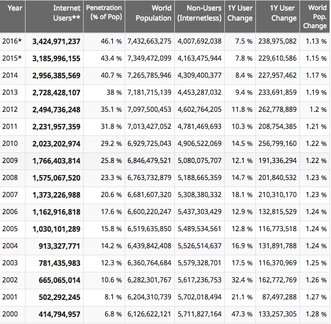
Also due to the advancement of technology now more than ever more people are using the internet which is widely accessible on their phones, tablets and computers.
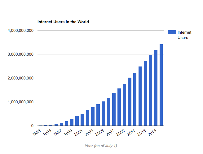
This findings show that is mandatory my app should be available on all different media platforms such as Apps and websites; which are compatible with Apple and Androids to ensure I tap into a wider market audience.
Learn English British Council
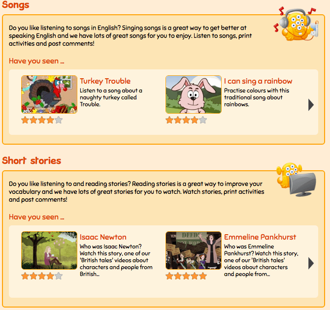
An App and website that helps children learn English. They offer an wide range of different teaching techniques for their users, using things such as music and animation to help engage and make learning fun.
I will be using the research from the past that show children can learning in different ways and specially children with learning difficulties tend to be more engage with education using non conventional methods such as reading a writing,
This app is only available on Google Play, this limits the amount amount of the intended audience and for this reason I will be aiming to make my app available on all different App search engines such as iTunes.
Learn English Kids also encourages interactive participation with the parents. This option gives parents advice and a chance to see their child’s progression. I really like this concept because it also engages the parents to join the process of their child eduction.
However the target audience is 6-12 years, which can cause another limitation on how many users can use their services. Having a learning difficulty stays with the individual throughout their life and i believe it shouldn’t be limited to a certain age. Also there as many students who go to secondary school without being speaking, reading and writing english. So this app does not cater to this market gap. I will be aiming to create an app that can be used until their are 16 years old so it can give them the best chance of gaining the grades that they deserve.
In addition this app does not offer my core appeal which is converting lesson plans to different languages. This can suggest that my concept will be a great unique venture in the hopes of changing how children learn without the language barrier.
Learn English Kids has over 100,000 downloads on Google Play, this suggest that there is market gap and need for my concept.
Design Interface
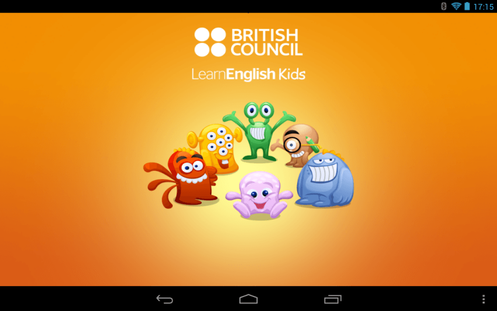
Once I completed my research on Learn English Kids (British Council) I download their app and i was completely shocked by their design interface.
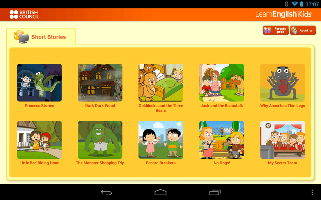
I went and asked my peers what they felt about the interfaces and 80% stated that they where left feeling unamused by the basic layout. Some even went on to say that the page looked unprofessional and low budget. Moreover, the app in my opinion is easy to navigate which means their users are able to navigate themselves to different pages. However because of the interface i feel like it could change certain elements to make the page more visually appealing which can result to the users being more engaged.
In Addition the app has a reoccurring colour theme that can been seen on their website and app. Children with learning difficulties often are engaged by bright colours and in that sense this app has catered to their visual needs.
The one thing i really did like and what to use is the idea of a logo type opening home page.
The use of different animated characters makes the app more visually appeal to the user. The use of bright colour which they all compliments each other and the colour theme gave me the impression “fun” an element I would love to incorporate to my own interface.
Sites Used:
https://fullfact.org/immigration/eu-migration-and-uk/
http://www.internetlivestats.com/internet-users/
https://www.migrationwatchuk.org/statistics-net-migration-statistics


Leave a comment