Firstly if my time frame allows it I would like to incorporate a demo animation of one of the chosen subjects that would play in the app to help and assist the user even more. This is would be a great way to help promote the product even further and can be used to show future investors, what the proposed product will look visually and it’s function.
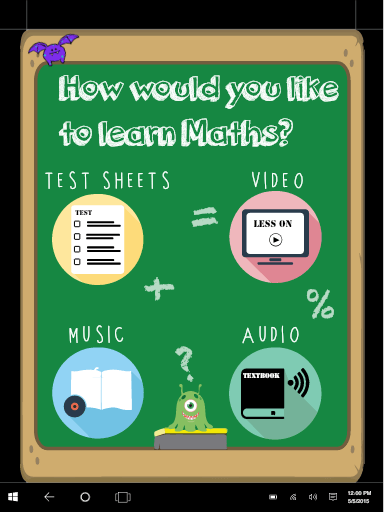
When designing my interface, I took inspiration from Pinterest and collected my finding on my own page. I created a prototype on Adobe XD and ensure I kept the consist colour theme throughout the page. When researching different interface idea I really liked the use of flat designs. It is simple and but yet effective on getting straight to the point and eliminates any confusion.
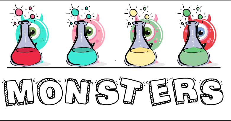
For the home screen I wanted to incorporate fun cute monsters that I created in illustrator. Before choosing what monster to use I created 4 different coloured monsters per monster and showed my intended audience and asked for their thoughts on each one. The reason why I chosen to get audience feedback am because it will help me understand my audience and what there likes and dislikes are.
Each page has the key colours of my visual identity, keeping the colour scheme throughout the product shows unity and professionalism. The functionality of each page corresponds to one of the 4 chosen colours.
Before deciding on my logo design I experimented with different fonts and colours drawing inspiration from the colour wheel. As stated above different colours represents a different emotions and are associated with words and I had to chose what colour embodies my brand identity. As you can see having the logo in one font looked simple but didn’t have the visual effect I desired. So I incorporated 2-3 different fonts and come up with logos that I thought where more visually appealing. I was also assist by 4 young individuals to help me chose what font worked well.
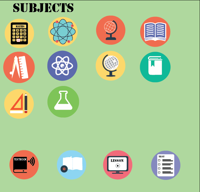
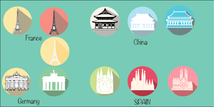
As I really liked the flat design logo’s I wanted to create flat design icons for each different functions of the proposed pages. I created different icons and spoke with my peers what they felt worked well with my proposed interface idea, however I ensured to keep the brand colours consist.

Upon completing the initial interfaces, I had spoken to my peers and gathered market research and they suggested that the interface did not fit in with the my intended brand identity. They had also stated that the page did not professional and that i should maybe explore different avenues instead of being generic.


