I felt like it was essential I did some competitive research on apps that offer the service of learning new language as I want to incorporate this element to my app.
Duolingo is a renown business/app that allows people to learn new languages free of charge. This is a great USP as learning a new language can be expensive limiting the amount of consumers.
The app offers a personalised, tailored ways to learn for each of their costumers. Research shows that everyone learns in different ways especially those’s with a learning difficulties; those who have a learning difficulty they are more likely not to be engage, less motivated to lean. Duolingo set their aim to make learning fun by using games, they believe that children are more likely to learn if learning is fun and non conventional. With the use of technology they are able to create an effective, innovative ways to learn.
Duolingo has over 120million users which indicates there is a market for concept.
Design interfaces
I then went on to download the app, it was so easy to navigate which is really good for those’s who cant read English.
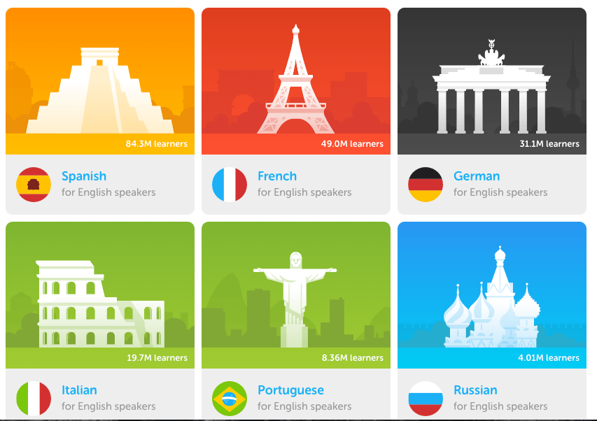
On the first page you have the option to pick what language you would like to learn using simple but effective icons. This has given me the inspiration to add icons instead of using text only. It also makes it the app more enticing and gives the impression that they understood there target market audience. What also stood out was that each icon used a colour that is used in the country national flag suggestion a clear pre production research and planning. Also having a coloured background with the images of famous monuments in the colour whites gives the page a nice fluid flow (cohesive). In addition have the country’s famous monuments acts as visual signifier, this idea will come in handy when creating my app as some of the students may not be able to read English but can identify with the monuments.

Interaction
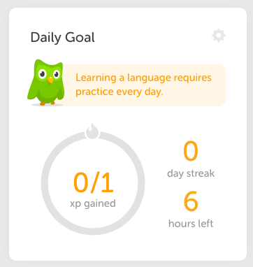
Duolingo allows the user to make a daily or weekly goals showing the users progression. This idea works ideally with my concept because it will encourage the parents and pupils to set goals for together with their idea speed and time. Children with learning difficulties often put of by deadlines and test in school, but this option will give them the confidence to set a goal for themselves outside school which they hope to achieve without it being officially marked in school.
Understanding The Limitations And Over Coming Them
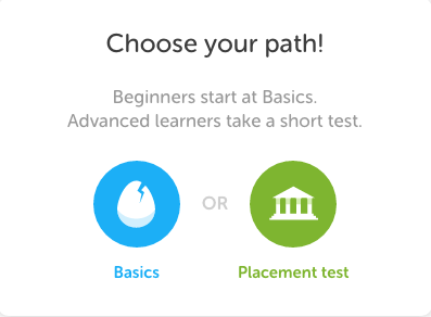
Duolingo also offers the users to pick the level of which they are in their chosen language. This is great way to create learning materials to suit different levels. Children are often are at different levels and one way that teacher can accommodate pupils is giving them worksheet that suits their level of learning. This option has given me the inspiration to have this option on my app, because it gives the variety of different materials to accommodate different levels. For example a pupil who is Dyslexic may be more advanced than a pupil who has zero to none understanding and it will be a mistake to have worksheets that is set to one level.

Icons
I one reoccurring theme throughout the app is the use of icons. Each Icon signifiers different categories and subject they are available to learn. Duolingo give the users more varieties of things to learn than Learn English Kids app. Having such a wide varieties of things to study gives the customer a chance to learn all the different aspect of the language but broken down to mini units. This is a great idea as my intended audience may be thrown by the amount of information given to them at once, but having mini units will allow them to concentrate on one subject at a time. Once they are confident about what they have learnt they are able to take a test to see how much they have learnt. This has given me the idea to add the option of having the answers available at the end of the test so they are able to see what they have answered wrong with an explanation. It will also give them the chance to re take the test and see the difference between the first try and their second try. This can also promote children’s ability to take feedback and implement it in the future.
Findings
Overall Duolingo has given me so much things to think about when creating my App such as what time of function will it have, layout and design. Duolingo has effectively achieved their aim to make learning fun and effective, using images and simple icons to engage the viewer.
Sites Used:

