Development

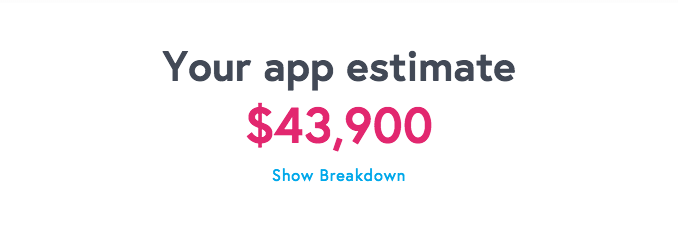
Firstly if my time frame allows it I would like to incorporate a demo animation of one of the chosen subjects that would play in the app to help and assist the user even more. This is would be a great way to help promote the product even further and can be used to show future investors, what the proposed product will look visually and it’s function.

When designing my interface, I took inspiration from Pinterest and collected my finding on my own page. I created a prototype on Adobe XD and ensure I kept the consist colour theme throughout the page. When researching different interface idea I really liked the use of flat designs. It is simple and but yet effective on getting straight to the point and eliminates any confusion.


Screen Shot 2017-04-21 at 12.19.05


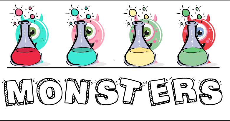
For the home screen I wanted to incorporate fun cute monsters that I created in illustrator. Before choosing what monster to use I created 4 different coloured monsters per monster and showed my intended audience and asked for their thoughts on each one. The reason why I chosen to get audience feedback am because it will help me understand my audience and what there likes and dislikes are.

Screen Shot 2017-04-21 at 12.37.05 Screen Shot 2017-04-21 at 12.37.19

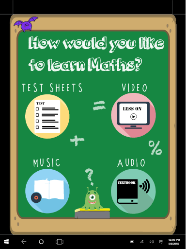
Each page has the key colours of my visual identity, keeping the colour scheme throughout the product shows unity and professionalism. The functionality of each page corresponds to one of the 4 chosen colours.


Before deciding on my logo design I experimented with different fonts and colours drawing inspiration from the colour wheel. As stated above different colours represents a different emotions and are associated with words and I had to chose what colour embodies my brand identity. As you can see having the logo in one font looked simple but didn’t have the visual effect I desired. So I incorporated 2-3 different fonts and come up with logos that I thought where more visually appealing. I was also assist by 4 young individuals to help me chose what font worked well.


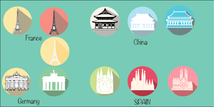
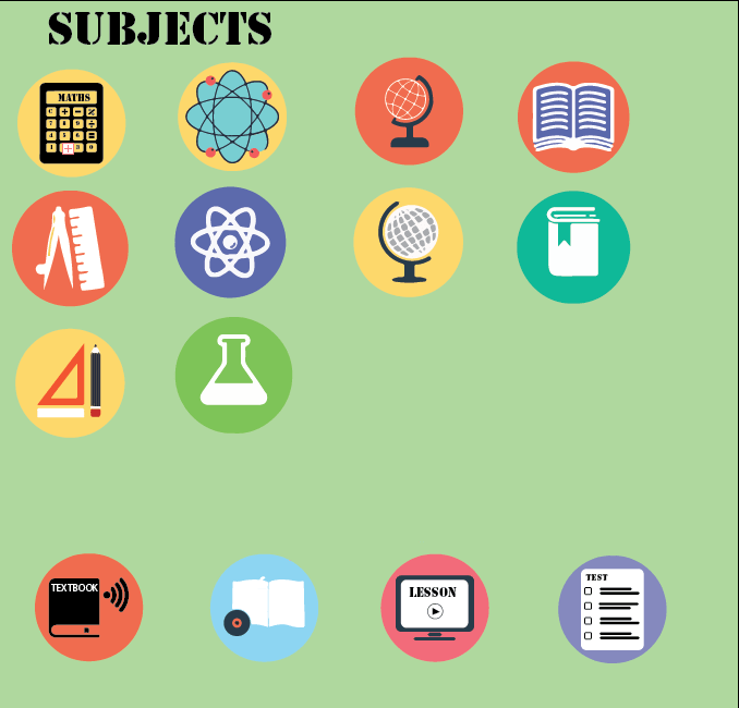
As I really liked the flat design logo’s I wanted to create flat design icons for each different functions of the proposed pages. I created different icons and spoke with my peers what they felt worked well with my proposed interface idea, however I ensured to keep the brand colours consist.

Screen Shot 2017-04-21 at 12.29.23


Screen Shot 2017-04-21 at 12.34.36


Upon completing the initial interfaces, I had spoken to my peers and gathered market research and they suggested that the interface did not fit in with the my intended brand identity.  They had also stated that the page did not professional and that i should maybe explore different avenues instead of being generic.


EVALUATION

Overall the interface for the final product was the strongest aspect of the whole brief. The colours worked well together and embodied the desired visual identity I was going for. The sheer transformation from the development to the final product showed cased how vital it is to take back constructive criticism and make a change. However, because of clear difference style of both interfaces one being more child friendly and the other more visually appealing to a older ratio of the intended audience, I feel like is a high percentage that the new interface might be more visually appealing but doesn’t have the simplistic element I was trying to achieve. With that being said I could see that in the future development that maybe the interfaces can change depending on the age of the user that will ultimately give the app a more personalised experience and really embody learning tailored to the user.

As my time management were poorly judge, if I where able to re do this project again I would send extra time learning the wireframe software so that I would be able to create a working prototype given me the chance to fully engage with the product and taking the idea to the next level. To be able to test the prototype on a actually phone, it would of given me the chance to see how the app looked on different screen size, I would be able to decide what work and what didn’t.

Also I would of loved to make a promotional advert about the functions of the app, such as a promo video of one of the pages and even gone as far as downloading translation app to create a interface in several different languages. The promotional animation would of showed cased the unique selling point of school nation wide being able to upload lesson plans and having different teaching techniques to give the user the best use of the application. Also having a translation option in languages such as Somali, Arabic, and Hindu will ultimately close the growing gap of language barriers in school.

In terms of the advert for Fun2Learn I had to vigorously watch YouTube tutorial on how to make and create my elements that where incorporated in advert. I am really proud of the rotating globe and accents, this for me personally took the advert to the next level. After Effects is challenging software but I am one of the those people who never detour from a hard challenge, there where points where I wanted to give up but upon finishing I was really proud and happy with the end product. I personally like how I kept the feel of flat design consist throughout the advert and adding external images when required. In the developing the advert It took me a while to realise that less is more. Initially I had so many images and moving components making the overall feel of the advert looking cluttered and rushed. In the add the advert looks sleek and professional.

Overall, I believe that there are aspect that could do with more improvement but generally I I feel like I completed the project to a high standard. Each assignment in digital media I have shown an improvement technically bring my work one step closer to a professional standard. With that being said I would definitely like to further the project so that the audience can full visualise the concept to its full capacity.

Budget 2.0

Once you have completed the above steps you can than start thinking about the cost of the production.

 Cost

Depending on what your aim is and what your are trying to achieve will effect your cost. I would need to consider whether I will be taking the Waterfall development route, the agile strategy or making my app alone. Depending on which one I chose the cost will vary as making an app can be expensive, certain media companies charge thousands to independent companies charing a couple of hundreds.

Before I make an decision I researched the advantages and disadvantages of each choice. The waterfall development is simply a detail plan of each process and its cost, this is ultimately going to have a the positive effect of being able to refer back to the paper work to find the  project timeline and if you wanted to alter or change something you have paper references.  However the disadvantage of the waterfall development is that it extends the timeline.

Moreover, the Agile strategy is the complete polar opposite. It is less planning and more production focused, the developers are able to start straight away. The advantage of this that the production moves faster making, but can lead to the cost piling up. On the flip side of having the ability to start production straight away the project lacks structure. However statistic’s show it is 3 times more successful than the waterfall development strategy .

Using the website http://howmuchtomakeanapp.com/ I was able to estimate the rough cost of hiring a freelance developer. My app estimate cost would $43,900 if they were to do everything and have all my desired functions. However this price is out of my price range so I went back to see if I find ways of save some money causing my cost to decrease. I did end up decreasing the cost by $14,900 giving me the total of $29,400.

Even though the cost decreased to $29,400, this was still high for me to afford. So i did some research on the process called ” market payout”. I found that each cloud service charge and do things differently. Google Play has the best offer as you can earn income after the first month after the launch, Whereby Android hold your money for a certain amount of time. Market payout comes with the disadvantage of only being able to earn money that succeeds their threshold, meaning your will only earn money if you reach the minimum required sells set by the cloud service provider.

Initial estimate

Screen Shot 2017-03-30 at 21.56.10

Cost saving estimate 

Screen Shot 2017-03-30 at 22.05.44

Budget

Research 

Before being able to come up with a budget for my application, I had to familiar myself with the different steps and progress of the app. I stumbled across a article on Forbes  https://www.forbes.com/sites/groupthink/2014/11/11/the-true-cost-of-building-a-mobile-app/#30ad9bae5876 , this article outlines a guide of the steps of creating an app.

From this article I gained the importances of makes a good app and it all starts with PRE PRODUCTION. Having a good idea isn’t enough to make an app successful it also entiles the following

Orgainastional skills: Being able to plan and stick to the schedule. 

Personnels: Finding the right team that suits your needs. These personnels should make a team with each member specialising in a particular area. 

Research: 

  1. How unique is your app. Is there other apps that are similar to yours? I have already done some research about other competitor. The two most similar app that are compatible with my proposal are “Duolingo” and “Learn English Kids” which i have researched in prior blog post.  However they don’t offer all of my core appeal functions.
  2. What media platform are you going to use?  Depending on what software you  chose  they will all have different programming and SDKs. I will need to research what platform would be in my best interest.
  3. What cloud services will you used? Once you chose your Media platform, you must decide on what cloud services provider will host your app and look after the end systems. Each cloud services charge different amounts for memberships so i will have detailing my choices throughout this post.

Sketching: Draw out your idea on paper before transferring them to wireframe so you can visualise your design.

Market Research: Get intended audience to try out the app and ask for constructive feedback. This is important as you are targeting a specific demographic.


The Name Of The App

” Your company name plays a monumental role in a brand’s growth and perception, meaning it can completely make or break a company.”   (Adam Fridman)

After reading many articles about the importance of branding and how the wrong branding can break your company or business idea.
As i struggled with the name of my app i devised a checklist which was the core underlaying tone is several articles. The name of the App is essentially the first form of contact for the customer. Relationships between businesses and consumers are based on their first impressions, meaning that the name must convey the RIGHT message.
 Secondly I had to ask myself does the name of my brand sum up everything about my brand. Costumers interact with the brands name, so picking a name that has some external value attached to it.
Lastly is the name unique? It really hard to find a unique and catchy name but this is why research is mandatory! The name of the brand is somewhat the identify of the company, so getting the right name to match these 3 criteria was a bit of a challenge but it
gave me a guideline to work through.
Here is the list of names I came up with:
TransFun- I wanted to combine the world translate and fun together, but when i did my market research many thought the name implied a dating app for the Transgender community.
FunsLate – This name didn’t sound right when spoken and didn’t make any sense.
Translate2Learn – It sounded very corporative and lack the catchy element.
tLearning – This name was inspired by “eLearning”. The T stands for translate.
Fun2Learn – This is was final name that i decided to go with as the other names favoured the translating option that is available on the app but it did not sum up the whole brand. Fun2Learn is catchy name and holds some values attached to the words that the customer can relate to. The name also convoys the right message of making learning FUN !!

Next Steps
My next step is to make a vector logo using Photoshop and Adobe illustrator. Once completed to get feedback from getting my intended audience to see what they liked and didn’t like.

Sites Used: